Chapter 6 Spreadsheet Charts
Contents
Chart Basics
|
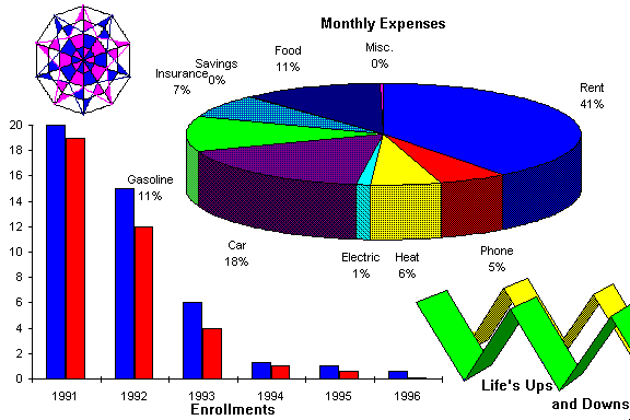
Chart Basics 1. Pick the chart type that you want. 2. Know if your data series (Y-Axis Values) is in rows or columns (which is first data series). 3. Pick the titles for the Chart, X-Axis and
Y-Axis. Figure 1 |
Spreadsheets deal with numbers and charts display numbers graphically. The old adage a picture is worth a thousand words holds true when it comes to charts. You can look at a series of numbers and not see a thing. Put those same numbers in a chart and you can see a trend or a pattern or something you could not spot intuitively by just looking at the raw data.
Making charts from your spreadsheet data is as easy as one two three four most of the time. OF COURSE you will want to follow the chart basic guidelines as shown in Figure 1. Let’s also go over some chart terminology see Figure 2 so we know what we are talking about and then we can learn how to create one.
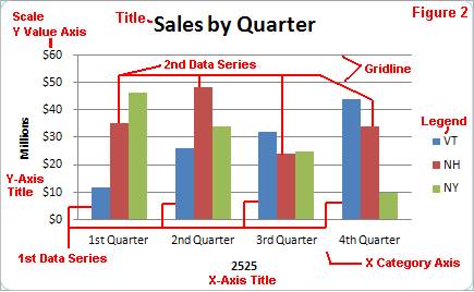
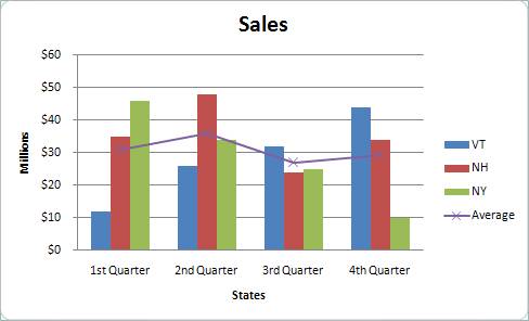
Title - is just a descriptive title to your chart, in this case Sales by Quarter.
X Axis - is the different categories of your data and is often called the category axis. In this case the different sales quarters. Some other examples of X Axis categories would be the actual sales people, grades, expenses, etc.
Y Axis - is the actual data values for each category and is often called the value axis. In this case the dollar amount of the sales for each quarter. Some other examples to match the X Axis samples would be the actual sales amounts, the number of people who received each grade, the actual amount of the expenses, etc.
Scale -
is the increments on the Y Axis. These are set automatically but they can also
be set manually.
Gridlines - are to help direct your eyes to the axis. In the sample, only Y-Axis gridlines are showing. X-axis gridlines would start from the X-axis and go up.
Legend - shows you what each data series stands for. If you count the items in your legend that is how many data series you have.
1st Data Series - is the first set of data values in your chart and corresponds to the 1st item in your legend. In Figure 2 it is VT and Figure 3 it would correspond to row 3.
2nd Data Series - is the 2nd set of data values in your chart and corresponds to the 2nd item in your legend. In Figure 2 it is NH and Figure 3 it would correspond to row 4.
1st X Category - is the first grouping of your data. In Figure 2 it is the 1st quarter or column B in Figure 3.
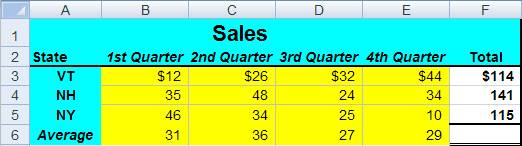
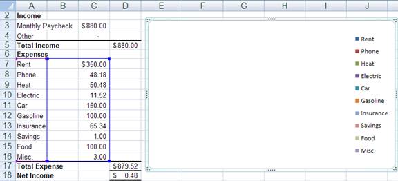
Let’s look at the actual spreadsheet data Figure 3 I used to create the chart in Figure 2.
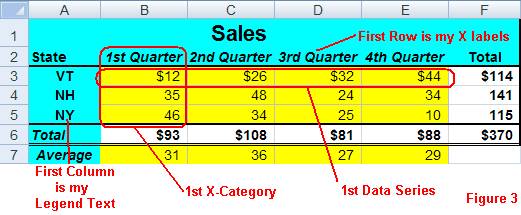
Notice that VT is the 1st data series, NH is the 2nd data series and NY is the 3rd data series. These are your Y values. The 1st Quarter sales is your 1st X category.
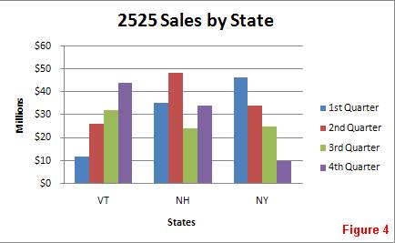
Let’s look at the same data only charted just the opposite Figure 4. In this case the data series is in columns and the categories are in rows. Our first data series is column B, the 2nd data series is column C etc. Our first X category is in row 3 and the second is in row 4 etc. Both charts are correct only they emphasis different points. You have to keep in mind what point you are trying to make. Here we have sales by state instead of sales by quarter.
Creating your first chart
 The
good news is that when you create a chart chances are that it will be exactly
what you want. The bad news is that if it does not look the way you want, it
may be troublesome to fix. Most of the time (99%) the chart should be what you
want. If you find you are spending twenty minutes on your chart just to get it
to look its best, your best bet is to just start over. Keep in mind that chart
making is a clicking thing, in other words you will use the mouse a lot.
The
good news is that when you create a chart chances are that it will be exactly
what you want. The bad news is that if it does not look the way you want, it
may be troublesome to fix. Most of the time (99%) the chart should be what you
want. If you find you are spending twenty minutes on your chart just to get it
to look its best, your best bet is to just start over. Keep in mind that chart
making is a clicking thing, in other words you will use the mouse a lot.
Your first step in creating the chart is to draw a rough sketch of how you think it will look (you can draw it in your mind if you like). This will give you an idea of the chart type that you want to use. Look at your data and get a picture of what your 1st data series and your 1st x category are going to be. Make a note as to whether your data series goes in a row or column.
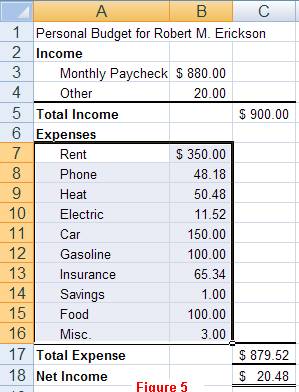
Now for the actual chart, you need to highlight the data that you want to chart including the text labels. Let’s use your personal budget. It should look like Figure 5 after you highlight the range.
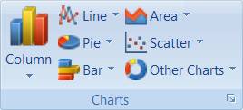
Now choose the Insert Tab and look at the Chart Group. You need to decide which chart type you are going to use. It is hard to say which is the best one since it all depends on what you are trying to say (i.e. your chart is trying to represent your numbers). The good news is that it is not hard to change the type to another one if you change your mind. Let me quickly give you a brief description of what each one is good for.
 Column
(Bar) - charts are good for comparing both
categories and data series. The first sub type is the common one. The second
column of sub types is called a stacked column (or bar) and it takes the second
data series and stacks it on top of the first data series (see area chart). The
third column of sub types is a one hundred percent where each data series is
added together and then instead of the value you get a percent (see pie chart).
Column
(Bar) - charts are good for comparing both
categories and data series. The first sub type is the common one. The second
column of sub types is called a stacked column (or bar) and it takes the second
data series and stacks it on top of the first data series (see area chart). The
third column of sub types is a one hundred percent where each data series is
added together and then instead of the value you get a percent (see pie chart).
Line - charts are good for showing trends and
fluctuations over time. This type is also good for showing predictions. The
first column of subtypes are the most common. The second column is a stacked
line and the third column is a one hundred percent line.
Pie - charts are good for getting the percentage
of how each category fits into the whole picture. You can only use one data
series for a pie chart. If you want more than one data series then you need to
choose a 100 percent chart type.
Scatter - charts are good for showing a correlation
between your data points and I leave this chart type to a statistics class.
Area - charts are good for showing the total of all
the data series and the area difference between your data series. The data
series are stacked on top of each other with the first data series being on the
bottom. The resulting top line of the chart is the total of all data series.
Other Charts like
Doughnut charts are similar to a pie chart only with a
hole in the middle. Really good for Grandma’s Bake Shop. Radar charts are good for drawing spider webs.
Actually I don’t know what they are good for but I would guess they are similar
to line charts in that they can show trends or fluctuations.
Each of the charts has several choices the 3-D charts have the same usefulness most of the time as the 2-D counterparts. There are times when a 3-D chart hides data and the 2-D chart is your better choice. There are other Misc. Charts and you can just try them to see if you like them! Simply choose the one that you feel will best represent the point that you are trying to make and a chart will be placed on your spreadsheet right away. Sometimes the chart is what you want and sometimes it is not. The chart tool guesses as to what you want plotted on the X and Y. If it is incorrect just switch the Row and Column. As soon as your chart is made you will now see a Chart Tools Design set of tools. Look for the Data Tab and choose Switch Row/Column Data. AT any point you can change the chart type by choosing Change Chart Type icon. Once you have your chart type figured out the next step would be to add titles to your chart.
 The chart Layout
tool is a bit tricky to understand at first but once you try a few of the
options you will get the hang of it. There will be several options that will
have Titles, Legends etc. In our pie chart example it will have - % in layout one (the one I would
choose anyway) which will show the name of the category and the percent value
that category takes up. You can right click anything on the chart to get a
popup menu that should have the formatting option that you are looking for. Depending
on what you have highlighted and what chart type you have determines what menu
options you will get. Hence it is hard t begin to explain them. I do think that
you can figure it out. For example to explode a piece of the pie chart you
click on it once, twice (if that makes sense) and then click and drag it away.
The chart Layout
tool is a bit tricky to understand at first but once you try a few of the
options you will get the hang of it. There will be several options that will
have Titles, Legends etc. In our pie chart example it will have - % in layout one (the one I would
choose anyway) which will show the name of the category and the percent value
that category takes up. You can right click anything on the chart to get a
popup menu that should have the formatting option that you are looking for. Depending
on what you have highlighted and what chart type you have determines what menu
options you will get. Hence it is hard t begin to explain them. I do think that
you can figure it out. For example to explode a piece of the pie chart you
click on it once, twice (if that makes sense) and then click and drag it away.
The last step of the process is to decide if you want the chart placed on a separate sheet or keep it on the worksheet. I said earlier, that I prefer to place the chart on a separate sheet but this is just a matter of personal preference. To move the chart to its own sheet, just use the Move Chart Location icon.
Combination Chart
There are so many chart types and options that it is really hard to give you a good example of all of them. I suggest trying all the different types and options to see how they look. Remember to choose the chart type that best portrays your point you are trying to make.
There is one more chart example that I do want to give and that is a combination column and line chart that I find useful on occasion. Given the spreadsheet shown below notice I have deleted the Total row and added Average row.
What I want to do is to add the average to the chart so I can see how each state did on average per quarter. I wanted the average to stand out as a line instead of as a column.
To create this chart I made a column chart first like we have talked about. I then clicked on the average data series so that only the average data series was highlighted. Next I click on the Chart Type and changed it to a line chart and since I only had the average data selected just the average became a line chart.
I like the way it shows how each state compares to the average, either above or below for that quarter. Again I suggest playing around with the different types to see what works for you. Don’t forget if you spend too much time it may be easier just to start over.
What’s Wrong With This Chart
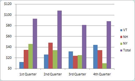
Looking at the chart above what is wrong with it? Technically nothing is wrong. However I have plotted the totals for the states on the same chart. This throws the proportions off by belittling the sales for each state. My personal opinion is that the totals should be on a separate chart altogether or to use a stacked column chart. A chart title would also be handy. Actually both items would be marked wrong if you did this on an assignment (totals and no title) On the chart below I have taken the totals off. You decide which you like better. It depends on what are you trying to say with your chart.
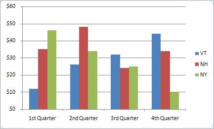
Can you see the difference? How did I take the totals off by the way? I clicked on the total so only it was highlighted and hit the delete key.
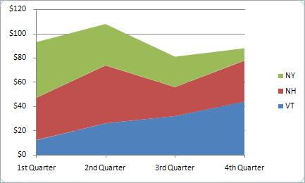
For this example I may not want to use a column chart but possibly an Area chart like shown below. The Area chart does show the total for each quarter by stacking the series on top of each other. The top line represents the total for all three states.
The biggest point to remember is to just keep trying the different charts to see what you like best. In the above examples I created the chart once and then just change the various options. Keep in mind that all of my samples are lacking a chart title and would lose points!
Looking above there is not much of a chart! Here is what happens when you try to make a pie chart when there is a blank column between the labels and the numbers. Remember that when you create a pie chart it only uses the first data series, which is column B in this sample. Let’s look at how a blank data series would look in a column chart.
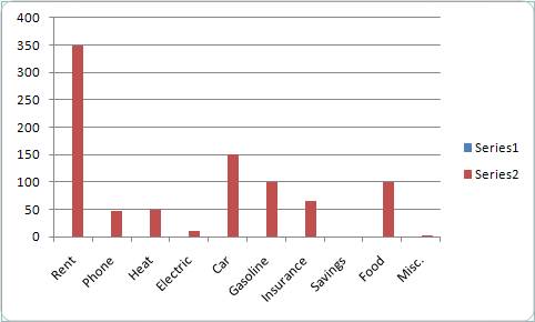
It may not be evident right away but notice that the legend has 2 data series. You could delete the legend and who would know? I would and it would be marked wrong. If you look at the bars themselves they are not centered between the tick marks on the X axis. This is the indication that you have a blank data series.
Not a problem, you can fix it. You could go back to the spreadsheet and get rid of the blank column and simply redo your chart.