Chapter 12 PowerPoint
Contents
Linking
a Spreadsheet Range or Chart
What’s
Wrong With This Presentation
Presentation Basics
|
Presentation Basics 1. Know what you
want to say. 2. Rehearse it! 3. Keep slides
short & simple. 4. Be careful of
Color. 5. Use the Spell
Checker! 6. Don’t read the
slides to us. Talk about the topics in more detail. 7.
Don’t adjust your UNDER GARMENTS in front of
everyone! Figure 1 |
By now you should be starting to get familiar with how these computer programs work. PowerPoint will look a little different than Word or Excel but many things will still be the same. You will open and save your files in the same way. You have inserted Clip-art into a word processor so that means you can do the same thing in PowerPoint. This chapter is going to be relatively brief. For the most part I only need to show you some features that PowerPoint has and you will be able to create a presentation relatively easily.
PowerPoint can provide you with Handouts to support your presentation, Speaker notes to help you in rehearsing your presentation and an outline of your presentation. The main point I want you to be able to do is to prepare a small computer presentation as most people abuse PowerPoint. So let’s start by discussing the different parts of PowerPoint.
Different Parts of PowerPoint
PowerPoint comes with many of the same toolbars that you have already seen. Half of the toolbar buttons you already know what they do. The drawing group is similar to what you find in Paintbrush and Word Art. The easiest way to learn the drawing toolbar icons is to play with them. Luckily you can leave your mouse on top of the button and you will get a little description of what the button is for.
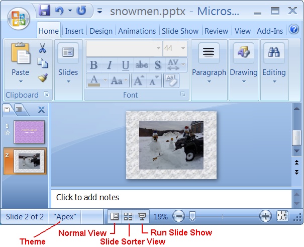
Theme - is the look to your slides, for example the color of the text and background.
Normal View - is shown above and is
pretty much the view you use to edit individual slides.
Slide Sorter View - shows you all of your slides at once in the order that they will appear. This is the view I use to add, delete, and arrange slides. This view gives you a nice overview of you slide show. You can add transition and build effects, and rehearse timing from this view. If you double click a slide it will take you to Normal view so that you may edit it.
Slide Show - will run your slide presentation. You can press ESC to cancel the show.
![]() Home Tab - is pretty much the same
with the Clipboard, Font, Paragraph and Editing Groups. The Slides group you
will use the New Slide icon a lot. Mostly you just pick what theme you want for
your slide. I generally just pick a title slide then add to it as I need to. You
may or may not use the Drawing group at all since it depends on your interests.
Home Tab - is pretty much the same
with the Clipboard, Font, Paragraph and Editing Groups. The Slides group you
will use the New Slide icon a lot. Mostly you just pick what theme you want for
your slide. I generally just pick a title slide then add to it as I need to. You
may or may not use the Drawing group at all since it depends on your interests.
In the font group the Increase/Decrease
Font ![]() allows you to change the size of the font by
just clicking the toolbar button. For a presentation a font size of 36 pt is
considered the minimum.
allows you to change the size of the font by
just clicking the toolbar button. For a presentation a font size of 36 pt is
considered the minimum.
Insert Tab - Pretty standard stuff, if you want to put something on your slide like clipart or a picture chances are this is the tab you need.
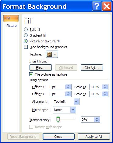
Design Tab – Again its pretty standard
stuff here to. The important icon is the Background
![]() Group as it takes you to the Format Background dialog box as shown
below. The texture drop down list box is handy.
Group as it takes you to the Format Background dialog box as shown
below. The texture drop down list box is handy.
Animation Tab – allows you to add animation to your slides and for the most part there are two types. The first type is for the objects on the slide and this would be in the Animation Group as shown. This lets you display the objects on your slide as you click instead of having the objects all show at once. In my example I added an effect for the bulleted list so each point comes up when I want it. As a rule of thumb I guess I never add an effect for the Title and just let that appear when the slide appears. You need to be careful about the SPEED of these effects as a 5 second delay in your speech is a LOOONNNGGG time.
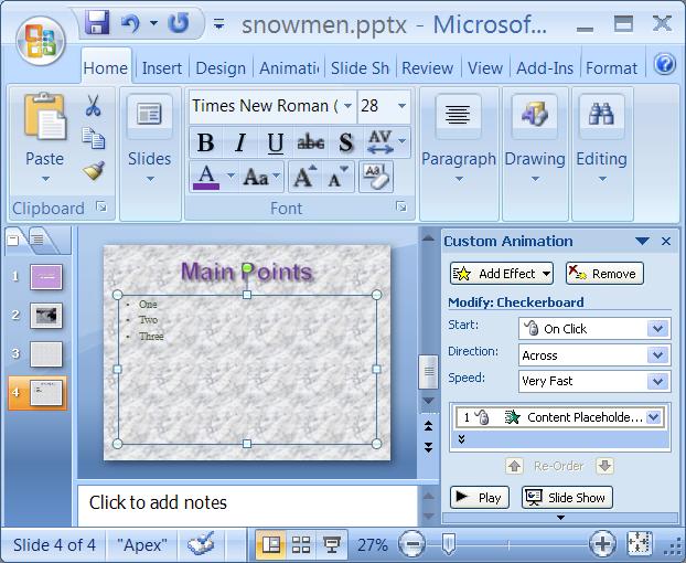
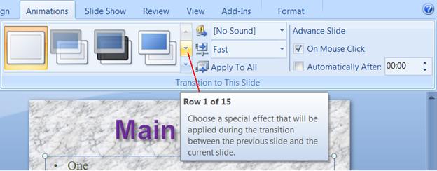
Transition to this Slide Group is the next form of animation and this is how the slides transition from one to the next. There are many features that you can choose and it just takes a little trial and error to come up with the transition that best fits your presentation. It’s a pretty big group as you can see below. Often times I just pick on the special effects, though it says 1 of 15 there are more if you look. I reckon they had trouble counting. Actually I think they mean 1 of 15 in that theme.
The rest of the tabs are pretty much straight forward and may just require a little playing around with to understand them. Under Review is where you would find the spell checker and other than that what is more important is YOU and how you give your speech. PowerPoint is just to help guide your audience along for the ride.
I don’t stress much on the handouts myself since most of the time no-one wants them. I opt instead to post the slideshow online so they can view at anytime.
Linking a Spreadsheet Range or Chart
This is repeated information from another chapter but to link a spreadsheet range or chart you would follow these simple steps.
1. Open both PowerPoint and Excel.
2. Place the slide you want the spreadsheet range or chart to go onto in Slide View.
3. Activate Excel. Highlight the Spreadsheet or Chart (if the chart is on a sheet by itself you only need to be looking at the chart).
4. Choose Edit, Copy. This will place a copy in the clipboard for you.
5. Activate PowerPoint. You should have the correct slide in Slide View.
6. Choose Edit, Paste Special. Paste will only put a copy of the chart in your slide. Paste Link will link the slide and the chart together meaning that when you make a change to the chart it will automatically be changed in the slide.
It’s pretty easy to do. A really neat thing is that you can do the same coping/linking with a Word Processing file as well. In fact you can Link Two Word Processing Files as well as, link a spreadsheet range or chart to a word processing file (like we have done before). The groovy thing is that you follow the same steps as outlined above for PowerPoint! When writing research papers it is always nice to include a graph or table and linking or coping is a nice way to do this.
This is enough information for you to get going on making your own slide presentation. It is always a good idea to practice the presentation on the computer and in the room you will be using. Keep in mind that you may be able to read your presentation on your computer screen but you will lose clarity using an overhead projection system. Some projection systems are better than others so just be careful with your different color schemes. You could be in for a surprise. As a rule of thumb stand 10 feet away from your computer screen and see if you can read your slides. This should give you the impression of sitting in the back of an average classroom.
Presentation Tips
If you are working in a group on your presentations it is always nice to have each member speak. Rehearse your presentation and practice the transition from one speaker to the next; it should go smoothly. Try and practice with another group so they can give you feedback.
It is always nice to look at your audience but some people may get nervous looking out into the crowd. You do not need to make eye contact to make it appear that way. In other words look towards your audience but do not look directly at any one person and you may not get so nervous. If anything, just keep looking at the back of the room, it will keep your head up and people will think you are looking at them. While you are talking, be careful not to walk in front of your projection screen even if you have a nice shadow!
Keep those hands out of your pockets and do not be jingling change! Try and put your hands on a pulpit or desk if you feel you are getting nervous. I like the desk as it keeps me from falling over in fright!
Keep your time to each slide around two to three minutes. Any longer and you have too much information on that slide. You will lose the audience’s attention.
Include a blank slide at the beginning and the end so that your audience sees a blank screen and not the PowerPoint window itself. It just looks a little more professional that way.
If you have studied your speech you have nothing to worry about, just get up there and talk to us. Have confidence in yourself. You can do it. Besides most likely you have to anyway for a grade, so give it your best shot. Good luck!
What’s Wrong With This Presentation
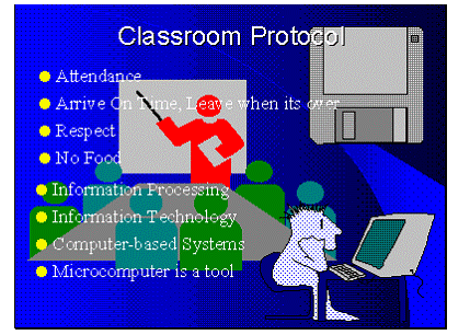
This slide is way too cluttered with JUNK! Clip-art pictures are nice but in this example they are overdone. It makes it hard to focus on the point of this slide. There are also 8 bullets which pushes the limit a little, a good maximum number is 7. More than that it is hard to think of all the items at once. I would recommend to delete all but one Clip-art picture and divide the bullets into 2 slides if possible (7 is not written in stone, use your own judgment).
Putting too much information on one slide is a no-no. There is an old saying called K.I.S.S. meaning Keep It Simple Stupid, maybe not the nicest thing to say but you should be able to get the point.
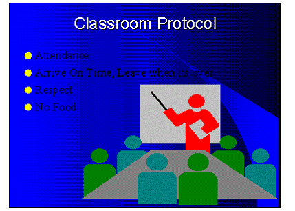 Well
I got rid of the extra clip-art pictures and have only 4 bullets this time. Not
bad, huh? Well it may be a little hard to READ the bullet items. The problem
now is I am using colors that do not mix very well. Black text on a blue
background may be readable when you are a foot away from the screen but get
back a little and it is almost impossible. White text on a blue background
works real well. So does yellow text on a black background. Try to stay away
from red on green, red on black, blue on green (as well as others) and look for
colors that contrast a lot. One way to check this is to run the slide show on
your PC but stand back 10 feet from the screen. This will give you an idea of
what it is like for your audience. Also keep in mind that when projecting a
presentation through an overhead projection system you WILL lose quality. Your
computer screen is much sharper than a projection system (some systems are
better than others).
Well
I got rid of the extra clip-art pictures and have only 4 bullets this time. Not
bad, huh? Well it may be a little hard to READ the bullet items. The problem
now is I am using colors that do not mix very well. Black text on a blue
background may be readable when you are a foot away from the screen but get
back a little and it is almost impossible. White text on a blue background
works real well. So does yellow text on a black background. Try to stay away
from red on green, red on black, blue on green (as well as others) and look for
colors that contrast a lot. One way to check this is to run the slide show on
your PC but stand back 10 feet from the screen. This will give you an idea of
what it is like for your audience. Also keep in mind that when projecting a
presentation through an overhead projection system you WILL lose quality. Your
computer screen is much sharper than a projection system (some systems are
better than others).
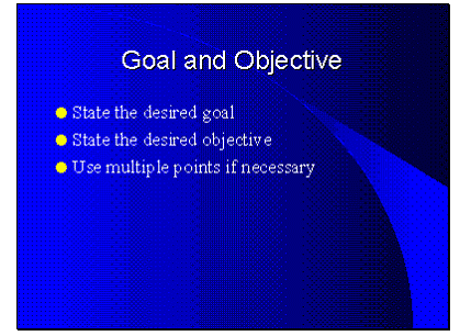 Well
this slide is a little plain and could probably handle a little prettying up.
Something simple like centering the bullet list would help improve this slide.
Simply click on the frame around the bullet list and drag it until it looks
centered. However the biggest mistake on this slide is the fact that I did not
change the default text in this template. This slide was created using the
AutoContent wizard and I just left it alone. You should delete the State the
desired goal and TYPE in what that GOAL IS! Never leave the default text on a
slide. If you do not know what to put there, delete the text or the whole slide
if need be. The text shown in this example just gives hints on what the slide
should talk about, you really need to put your OWN words here.
Well
this slide is a little plain and could probably handle a little prettying up.
Something simple like centering the bullet list would help improve this slide.
Simply click on the frame around the bullet list and drag it until it looks
centered. However the biggest mistake on this slide is the fact that I did not
change the default text in this template. This slide was created using the
AutoContent wizard and I just left it alone. You should delete the State the
desired goal and TYPE in what that GOAL IS! Never leave the default text on a
slide. If you do not know what to put there, delete the text or the whole slide
if need be. The text shown in this example just gives hints on what the slide
should talk about, you really need to put your OWN words here.
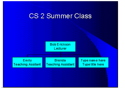
Not a bad slide, I used some nice contrasting colors. However I left an unused box in this organizational chart. I may have wanted to add another teaching assistant but since I have just two of the best TA’s around I should have deleted the unused box. It is not hard to delete the empty box simply click on it and press the delete key in slide view.